Pollen One
Improving user retention amidst a major product paradigm shift
OVERVIEW
I led the end-to-end designs for Pollen Mobile’s biggest launch of 2023: a two-sided cellular data service. The launch followed a complete restructuring of Pollen’s reward system from a decentralized token economy to a USD-based system.
I strategized and designed an MVP to bridge existing customers from our decentralized network to a paid data network, with a goal of minimizing customer attrition.
The launch of Pollen One completely exceeded expectations of success, achieving a 73% conversion rate and monetizing the usage of over 18,000 GBs of cellular data.
MY ROLE
Product Designer
TIMELINE
6 weeks (Jan – Feb 2023)
TEAM
Victoria Pacchiana – COO
Emily Pye – Product Manager
Sridatta Kompella – Engineer
Aaren Stade – Engineer
CORE FEATURE
Product landing page

CORE FEATURE
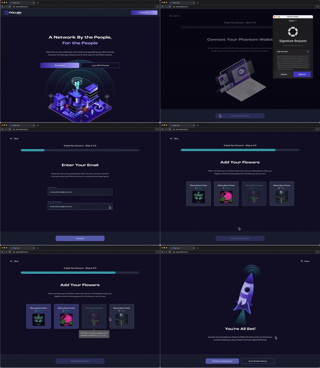
Guided account creation

CORE FEATURE
Network monitoring dashboard

CORE FEATURE
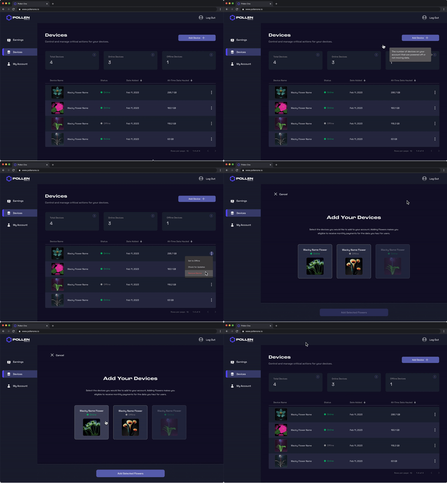
Device and account management

CORE FEATURE
Activity data visualizations

PROJECT SUMMARY
At a glance...
PROBLEM
An abrupt change and concerned users
The sudden announcement of a USD-based payment model left many Pollen customers disappointed and concerned for their future earnings.
SOLUTION
An empathy-driven product experience
I designed an MVP to onboard users onto a new cellular data service, creating a new revenue stream for data providers and increasing business value.
IMPACT
Expectations exceeded
The launch of Pollen One was met with favorable KPIs:
-
Conversion rate of 73%
-
Task success rate of 81%
-
Projected annual revenue increase of $200,000
BACKGROUND
The Pollen ecosystem
Pollen Mobile was built to foster a user-driven cellular network that provides affordable, reliable coverage.
Pollen found a niche in the De-Wi (decentralized wireless) market, selling small-cell radios to customers looking to create their own cell coverage. These customers were rewarded with Pollen’s cryptocurrency, PCN, for providing end users with coverage.
Pollen quickly garnered a loyal customer base of crypto-enthusiasts. However, we wanted to reach a new demographic of customers willing to pay for exclusive access to our network, built with the help of existing users.
Device nomenclature

Diagram of Pollen's network structure
Flowers
Small-cell radios and antennas that broadcast coverage and haul cellular data to end users.
Bees
Network scanning devices that validate coverage and report network statis from other cell providers.
Birds
End user equipment, such as mobile phones and eSIM cards, that receive cell coverage from Flowers.
THE PROBLEM
The shift from token rewards to US dollar payments left many Pollen users concerned for the value of their earnings.
PROBLEM CONTEXT
A win for some, a perceived loss for others
Our stakeholders were eager to introduce a combination crypto-US rewards model, positioning us to launch a paid data service and expand our customer base beyond crypto-enthusiasts. This would allow existing Pollen users to earn money for providing cellular data to new customers.
While many users were excited to start earning USD payments, the sudden shift away from crypto came as an unwanted surprise to others in the Pollen community.
Conflicting business and user goals
Stakeholders wanted to embrace a crypto-USD rewards system, but some customers disapproved.
Starting from scratch
The abrupt change to rewards meant completely rethinking the cellular data product we had planned.
6-week deadline
Building a launch-ready product in just six weeks meant working at breakneck speed.
DESIGN OPPORTUNITY
Create an engaging first-time experience for our new cellular data product, introducing US$ payments to existing Pollen users.
DESIGN GOALS
Optimizing for existing customers
To ease users into our new rewards model and build excitement for the next phase of Pollen, we decided to build a platform specifically for existing customers.
This platform, named Pollen One, would onboard users onto our new paid data service and allow them to register their devices to earn USD payments for providing cellular data to others.
Empathy-driven UX
Develop a simple, intuitive flow that minimizes frustration and conveys the product clearly.
Design for delight
Uncover opportunities to create a joyful user experience and build interest in the product.
Overdeliver – within reason
Keeping various constraints in mind, create a quality product that satisfies users' needs.
IDEATION
UX touchpoints and features
I began by mapping out the expected user journey through four key touchpoints, including the tasks to be completed and the experience that each might elicit.

USER FLOW
Creating a stepped process – less is more
Because successful account registration was critical for capturing users, my first priority was mapping the signup process in detail.
I stripped down the first-time user flow to its most essential parts to really understand the purpose of each step.

A glaring problem – and a simple fix
My initial flow revealed a glaring problem: a 7-click signup process, which posed the risk of a high drop-off rate. There had to be a middle ground between a fully frictionless experience and essential user actions.
With the help of engineering, I found a solution—leveraging users' Phantom Wallet accounts as an SSO method, reducing the flow to just 3 steps.

DESIGNS
Tracking progress visually
A visual indicator of progress was key in giving users a sense of progression, motivating them to complete the multi-step signup flow.
Although a labeled stepper component would showcase the sequence of steps in detail, I opted for a progress bar, which would convey the length of the process and orient users without overwhelming them with the tasks they still needed to complete.
Vertical Stepper
Progress Bar


Explicit labeling sets expectations for the length/difficulty of the process
Anticipation of future steps may lead to burnout/drop-off
Stepper component might not scale well on smaller screen resolutions
Informs users of the length of the process and their current location
Creates a sense of progression without distracting users with future steps
Users won't know what to expect until they arrive at each step
DESIGNS
Creating a cohesive signup process
The “Add Devices” action lets users choose which of their Pollen devices they want to link to their Pollen One account, allowing them to earn money for extending the network that cellular data subscribers pay for.
I initially separated account creation and device addition for faster user acquisition. However, allowing registration without added devices didn't make sense for users or the business. Accounts without devices would not generate any revenue, meaning zero earnings for owners of Pollen radios.
Register and Add Devices Separately

Combined Process

Fewer steps means reduced time to value
Device dashboard has no data until the user adds devices
Accounts with no devices do not add any value to the cellular network
Sets and meets user's expectation of completing the entire task in 5 steps
One unified signup process flows better than two discrete processes
An additional step = another click, possibly increasing task fatigue
DESIGNS
Freshness and familiarity – light vs. dark UI
To introduce Pollen One as the flagship product of Pollen's next phase, our CEO proposed a light UI theme, a significant departure from our original dark theme. However, I sought a balance between freshness and familiarity.
Since many existing Pollen customers were already concerned about recent changes, I wanted to avoid adding to their anxiety. Applying a UI theme that users associated with our brand would provide a reassuring sense of continuity.
Light UI Theme

Dark UI Theme

New UI theme visually signals a new phase for Pollen
Users may find a new UI theme jarring and unexpected
Users already associate a dark theme with Pollen's brand
Familiar styling makes a new product feel less foreign
DESIGNS
Dashboard landing experience
The next phase of designs focused on defining post-account creation features. A dashboard would enable users to closely monitor the earnings and network activity of their Pollen devices.
I used a modular layout to map out the presentation of data within the dashboard.
Modular Layout

Users' needs at the forefront
We had an opportunity to establish Pollen One as a valuable network monitoring tool by incorporating direct user feedback and delivering requested functionality.
Requested features included:
-
More detailed tracking of rewards
-
Monitoring of data hauled over time
-
Data usage by end-users
-
All-time device statistics
Feature Planning and Organization

DESIGNS
Surfacing valuable data
Much of the advanced monitoring functionality that users had requested could be displayed dynamically with data visualizations.
Design explorations revealed that some datasets and visualizations were more valuable and glanceable than others.
Data Visualization Explorations

Line graphs are a useful model for showing change over time
Graphs lacking device-specific data will offer limited value to users
Horizontal percentage bar graph is not a data model most users are familiar with
Final Designs

Showing data totals inside pie charts improves glanceability
Date range pickers improve interactivity and monitoring of stats over time
Graph legends may become difficult to scan for users with 10+ devices
DESIGNS
Defining a minimum viable product
While the dashboard provides valuable account management information, it is largely a visual tool, and does not require many specific user actions.
My objective in designing an MVP dashboard was to showcase Pollen One's core capabilities and generate anticipation for its future functionality. Given our tight schedule, prioritizing essential features was also in our team's best interest.
Dashboard: Final Design

Device Management: Final Design

DESIGN SYSTEM
Building upon existing design conventions
In the spirit of balancing freshness with familiarity, I combined existing Pollen design components with a few new additions. Interactions that were unique to Pollen One warranted custom components, including a progress bar, tile buttons, and vertical navigation tabs.
I defined each state and visual property, and provided usage guidelines. This served as a single source of truth for visual design, speeding up collaboration with engineering.

USABILITY TESTING
Evaluating UX in real-time
To observe how users interacted with Pollen One and reveal any usability issues, I conducted an internal usability study with 10 users.
The task success rate for the entire study was 91%. To our relief, metrics indicated that the product was performing successfully!

FINAL SOLUTION
Progressive onboarding
A stepwise onboarding journey guides users through configuring SSO, enrolling their selected devices as data providers for fellow Pollen One users, and completing Stripe registration to receive monthly payments.

FINAL SOLUTION
Earnings and activity dashboard
Following successful account registration, users are directed to the Earnings page, where a dynamic dashboard presents real-time metrics on the earnings and network activity of their devices.

FINAL SOLUTION
Device management
Users are able to monitor and control their enrolled devices. They can also easily add additional devices that were not added during initial registration.

FINAL SOLUTION
Account management
Users have the flexibility to manage and update specific account features at any time. They can also retrieve and download their monthly earnings statements.

RESULTS & REFLECTION
A successful launch and a bright future!
Upon launching, Pollen One was met with swift, positive feedback from our customers.
Post-launch conversations with users revealed increased confidence in the profitability and continued growth of the Pollen network, thanks to Pollen One. Users also praised the dashboard's functionality and the overall visual design, including the illustrations.
Sweat the details
Carefully considering each design decision and anticipating users’ behaviors led to a positive user experience.
Lean UX in action
Collaboration with the product team, informed assumptions about customers, and forward thinking helped us build a successful MVP.
Redlining designs
Documenting the details in my design specs, such as sizing, spacing, and colors, made development more efficient.